SEOhub Introduction
This documentation will give you an understanding of how SEOhub template is structured and guide you in performing common functions.
NOTE: we will not respond to any support questions on Item comment section or through e-mail. If this document doesn’t answer your questions feel free to open up a private ticket in our support forum
If you want to customize, please contact us here: our support forum
Author: Potenza Global Solutions
Installation
Follow the steps below to get started with your Site Template:
- Open the
... /TemplateFolder to find all the Templates Files - You will need to Upload these files to your Web Server using FTP in order to use it on your Website.
- Make sure you upload the required
files/folderslisted below:css– Stylesheets Folderfonts– Fonts Folderimages– Images Folderjs– Javacripts Folderphp– php Folderrevolution– Revolution slider all filesindex-1.html– (and All HTML files that you want)
The other files can be used according to your preferences.
- You’re now good to go..! Start adding your Content and show off your Brand New Beautiful Website in style.
Basic template Structure
The template has a responsive layout and is based on the Bootstrap V3+ Framework. Bootstrap is the most popular HTML, CSS, and JS framework for developing responsive, mobile first projects on the web. Click Here to know more about Bootstrap.
HTML Structure
The general HTML structure is the same throughout the template. Here is the general HTML structure of the template:
<!DOCTYPE html>
<html lang="en">

  <head>
    [Page meta, page css, page title etc...]
  </head>

  <body>

  <!-- preloader -->
  <div id="loading"> [LOADER CONTENT] </div>
  <!--preloader -->

  <!--header -->
  <header id="header" class="">
  <div class="topbar">
    [TOP BAR CONTENT]
  </div>

  <div class="menu">
    <nav id="menu" class="mega-menu">
      [MENU CONTENT]
    </nav>
  </div>
  </header>
  <!--header -->

  <!--Slider- -->
  <section class="rev_slider_wrapper">
    [SLIDER CONTENT]
  </section>
  <!--Slider -->

  <!--Section 1 -->
  <section>
    [SECTION 1 CONTENT]
  </section>
  <!--Section 1 -->

  <!--Section 2 -->
  <section>
    [SECTION 2 CONTENT]
  </section>
  <!--Section 2 -->

  <!--footer -->
  <footer class="footer">
    [FOOTER_CONTENT]
  </footer>
  <!--footer -->

  <div class="back-to-top">
    [BACK TO TOP CONTENT]
  </div>

  [PAGE JAVASCRIPTS HERE]

  </body>
</html>
CSS Structure
The general CSS structure is the same throughout the template. Here is the general CSS structure of the template:
<!-- Favicon -->
<link rel="shortcut icon" href="images/favicon.ico" />
<!-- bootstrap -->
<link rel="stylesheet" type="text/css" href="css/bootstrap.min.css" /
<!-- mega menu -->
<link rel="stylesheet" type="text/css" href="css/mega-menu/mega_menu.css" />
<!-- font awesome -->
<link rel="stylesheet" type="text/css" href="css/font-awesome.min.css" />
<!-- Themify icons -->
<link rel="stylesheet" type="text/css" href="css/themify-icons.css" />
<!-- owl-carousel -->
<link rel="stylesheet" type="text/css" href="css/owl-carousel/owl.carousel.css" />
<!-- revolution -->
<link rel="stylesheet" type="text/css" href="revolution/css/settings.css" />
<!-- main style -->
<link rel="stylesheet" type="text/css" href="css/style.css" />
<!-- Responsive -->
<link rel="stylesheet" type="text/css" href="css/responsive.css" />
Javascript Structure
The general Javascript structure is the same throughout the template. Here is the general Javascript structure of the template:
<!-- jquery  -->
<script type="text/javascript" src="js/jquery.min.js"></script>
<!-- bootstrap -->
<script type="text/javascript" src="js/bootstrap.min.js"></script>
<!-- mega-menu -->
<script type="text/javascript" src="js/mega-menu/mega_menu.js"></script>
<!-- owl-carousel -->
<script type="text/javascript" src="js/owl-carousel/owl.carousel.min.js"></script>
<!-- magnific-popup -->
<script type="text/javascript" src="js/magnific-popup/jquery.magnific-popup.min.js"></script>
<!-- appear -->
<script type="text/javascript" src="js/jquery.appear.js"></script>
<!-- counter -->
<script type="text/javascript" src="js/counter/jquery.countTo.js"></script>
<!-- custom -->
<script type="text/javascript" src="js/custom.js"></script>
Compiling Sass
Overview
Sass is perhaps the most popular of the CSS pre-processors; for years it’s helped us write clean, reusable and modular CSS. In this quick tutorial, I’ll cut straight to the stuff that matters and explain how to compile Sass into CSS using the command line.
Install Node.js
To compile Sass via the command line, first we need to install node.js. Download it from the official website nodejs.org, open the package and follow the wizard.
Initialize NPM
NPM is the Node Package Manager for JavaScript. NPM makes it easy to install and uninstall third party packages. To initialize a Sass project with NPM, open your terminal and CD (change directory) to your project folder.
Once in the correct folder, run the command npm init. You will be prompted to answer several questions about the project, after which NPM will generate a package.json file in your folder.
Install Node-Sass
Node-sass is an NPM package that compiles Sass to CSS (which it does very quickly too). To install node-sass run the following command in your terminal: npm install node-sass
Everything is ready to write a small script in order to compile Sass. Open the package.json file in a code editor. You will see something like this:
{
  "name": "sass-demo",
  "version": "1.0.0",
  "description": "",
  "main": "index.js",
  "scripts": {
    "test": "echo \"Error: no test specified\" && exit 1"
  },
  "author": "",
  "license": "ISC"
}
In the scripts section add an scss command, under the test command, as it’s shown below:
"scripts": {
  "test": "echo \"Error: no test specified\" && exit 1",
  "scss": "node-sass --watch scss -o css"
}
Let’s go through this line word by word.
node-sass: Refers to the node-sass package.--watch: An optional flag which means “watch all .scss files in the scss/ folder and recompile them every time there’s a change.”scss: The folder name where we put all our .scss files.-o css: The output folder for our compiled CSS.
Run the Script
To execute our one-line script, we need to run the following command in the terminal: npm run scss
Hurray! We are watching and compiling SASS.
Favicon icon
Favicon is an icon associated with the URL that is displayed at various places, such as in a browser’s address bar or next to the site name in a bookmark list.
You can add a Favicon to your Website using the following code:
<link rel="shortcut icon" href="images/favicon.ico"/>
Page Loading Transitions
Page Loading Transitions are enabled by default. If you wish to disable the page loading transitions you can simply delete the below section.
<div id="loading">
  <div id="loading-center">
    <img src="images/loader.gif" alt="">
  </div>
</div>
You can update loading animation by replacing loader.gif with your loader.gif file in the images folder.
Logo Settings
The Logo Container can be found in the Header Container – #header. Replace "logo.png" with your own logo image URL.
<ul class="menu-logo">
  <li>
    <a href="index.html"><img id="logo_img" src="images/logo.png" alt="logo"> </a>
  </li>
</ul>
Note Default height of logo is 40px. you can set height according to your logo type and your requirement.
Color Schemes
You can change your Website’s Color Scheme in an instant. There are 2 super easy options to change your website color.
Option 1: You simply need to include an existing color scheme from (css/skins/skin-yourcolor.css) and include inside head See example below:
<link href="css/skins/skin-blue.css" rel="stylesheet" type="text/css" />
Option 2: Change the Color Code in the css/skins/skin-defult.css and include inside head See example below:
<link href="css/skins/skin-defult.css" rel="stylesheet" type="text/css" />
Changing Fonts style
You can add/change the site font, from all fonts used from Google Web Font Services, with the one that suits you the best. You can find the font code in top of the style.css file in the CSS folder:
@import url('https://fonts.googleapis.com/css?family=Lato:300,300i,400,400i,700,700i,900|Montserrat:400,700');
To include new font you can simply add another line like this:
@import url('https://fonts.googleapis.com/css?family=Lato:300,300i,400,400i,700,700i,900|Montserrat:400,700');
@import url(https://fonts.googleapis.com/css?family=Open+Sans:400,300,600,800,700,300italic,400italic,600italic,700italic,800italic);
Or add an | separator and paste Roboto:400,300,800,700,600 after default website fonts link.
In order to change the fonts, you will need to edit the above links with your custom font, if you plan to use a Google Font or remove it completely. If you plan to use a self hosted font, here is an Example of using Self Hosted Fonts
Header
Helper Classes
We have created some really useful helper classes for you. These classes help you to quick position elements without writing new CSS rules. These classes are generic helper classes predefined in the CSS pages, here is quick view what they can do
Page section padding
You can add this helper class to set section padding top 80px and padding bottom 80px.
Add page-section-ptb class in section tag. See example below:
<section class="... page-section-ptb">
   [YOUR CONTENT]
</section>
Note Use this helper class to maintain all page section spacing. You can also use page-section-pt for only padding top and page-section-pb for only padding bottom.
Section title
You can use this code for your page section title to maintain title style.
<div class="section-title">
  <span class="text-white">Section title's sub title</span>
  <h2 class="text-white">Section title </h2>
  <div class="separator"></div>
</div>
Text color
You can use color in the Text. simply add .text-blue ( or any color you want) class where you want to use. See example below:
<div class="text-blue">
  [YOUR TEXT CONTENT]
</div>
Note We include 4 color helper class in our template text-blue, text-white, text-black and text-gray. you can add unlimited color class according to your needs.
Background color
You can use color in the background. simply add .blue-bg (or any color you want) class where you want to use. See example below:
<div class="blue-bg">
  [YOUR CONTENT]
</div>
Note We include 4 background color helper class in our template blue-bg, white-bg, dark-gray-bg and gray-bg You can add unlimited background color class according to your needs
Background Images
Background
You can use an image in the background with parallax effect with simply add InlineStyle in div tag and by use of this you can create your own bg. See example below:
<div style="background-image:url(Path); ">
  [YOUR CONTENT]
</div>
If your background is small and you want to use repeated background then use styling property background-repeat and set the value repeat or no-repeat. See the example below:
<div style="background-image:url(Path); background-repeat:no-repeat;">
  [YOUR CONTENT]
</div>
If you want to use your background like cover or container so, you just add styling property background-size and set the value cover or cointainer. see the example below:
<div style="background-image:url(Path); background-size:cover;">
  [YOUR CONTENT]
</div>
Background overlay
You can add this .bg-overlay-black-10 class to any element in your HTML code to apply overly color on any image or any section. See example below:
<div class="bg-overlay-black-10">
  [YOUR CONTENT]
</div>
Here are some predefined overlay classes you can use:
| Class | Description | Class | Description |
|---|---|---|---|
.bg-overlay-black-10 |
which means apply black color overlay with 0.10 overlay | .bg-overlay-black-20 |
which means apply black color overlay with 0.20 overlay |
.bg-overlay-black-30 |
which means apply black color overlay with 0.30 overlay | .bg-overlay-black-40 |
which means apply black color overlay with 0.40 overlay |
.bg-overlay-black-50 |
which means apply black color overlay with 0.50 overlay | .bg-overlay-black-60 |
which means apply black color overlay with 0.60 overlay |
.bg-overlay-black-70 |
which means apply black color overlay with 0.70 overlay | .bg-overlay-black-80 |
which means apply black color overlay with 0.80 overlay |
.bg-overlay-black-90 |
which means apply black color overlay with 0.90 overlay | ||
.bg-overlay-white-10 |
which means apply white color overlay with 0.10 overlay | .bg-overlay-white-20 |
which means apply white color overlay with 0.20 overlay |
.bg-overlay-white-30 |
which means apply white color overlay with 0.30 overlay | .bg-overlay-white-40 |
which means apply white color overlay with 0.40 overlay |
.bg-overlay-white-50 |
which means apply white color overlay with 0.50 overlay | .bg-overlay-white-60 |
which means apply white color overlay with 0.60 overlay |
.bg-overlay-white-70 |
which means apply white color overlay with 0.70 overlay | .bg-overlay-white-80 |
which means apply white color overlay with 0.80 overlay |
.bg-overlay-white-90 |
which means apply white color overlay with 0.90 overlay |
Note You can create your own helper classes by creating the class in the stylesheet as per your requirement. This helper class only support RGBA color values.
Text align
You can add this helper class to any element in your HTML code to set text-align
| Class | Description |
|---|---|
.text-left |
which means text-align: left; |
.text-right |
which means text-align: right; |
.text-center |
which means text-align: center; |
Separator
You can add this helper class to any element in your HTML code to add Separator line. Simply add hr tag where you want to add the line. See example below:
...
  [SECTION 1 CONTENT]
...
</section> <!--Section 1 End-->
  <hr/>
<section> <!--Section 2 Start-->
...
  [SECTION 2 CONTENT]
...
Label
You can add this helper class to any element in your HTML code to make a label. Simply add label and label-danger (or any given below) class where you want to add a label. See example below:
<span class="label label-danger">Label name</span>
Here are some default labels you can use or you can make your own label as per your requirement.
| Class | Description | Result |
|---|---|---|
.label-default |
Default label | Default |
.label-primary |
Primary label | Primary |
.label-success |
Success label | Success |
.label-info |
Info label | Info |
.label-warning |
Warning label | Warning |
.label-danger |
Danger label | Danger |
Sliders
We include 3 different sliders for you to be used on any Page with 100s of Options. List of the Sliders included are mentioned as follows:
- Revolution
- Owl carousel
Revolution
Revolution Slider is a premium plugin, an awesome animated slider that creates eye-catching sliders.
Please find the full online Revolution Slider documentation.
Note
To load Revolution slider locally we included below js in all home pages. You can remove it when you upload the files to your web server. You don’t need these js files to load slider on live server. If you remove these js your slider will not work locally.
<!-- SLIDER REVOLUTION 5.0 EXTENSIONS
(Load Extensions only on Local File Systems !
The following part can be removed on Server for On Demand Loading) -->
<script type="text/javascript" src="revolution/js/extensions/revolution.extension.actions.min.js"></script>
<script type="text/javascript" src="revolution/js/extensions/revolution.extension.carousel.min.js"></script>
<script type="text/javascript" src="revolution/js/extensions/revolution.extension.kenburn.min.js"></script>
<script type="text/javascript" src="revolution/js/extensions/revolution.extension.layeranimation.min.js"></script>
<script type="text/javascript" src="revolution/js/extensions/revolution.extension.migration.min.js"></script>
<script type="text/javascript" src="revolution/js/extensions/revolution.extension.navigation.min.js"></script>
<script type="text/javascript" src="revolution/js/extensions/revolution.extension.parallax.min.js"></script>
<script type="text/javascript" src="revolution/js/extensions/revolution.extension.slideanims.min.js"></script>
<script type="text/javascript" src="revolution/js/extensions/revolution.extension.video.min.js"></script>
Owl carousel
This excellent carousel slider can be controlled using HTML5 data attributes.
Find the full online owl carousel Slider documentation.
Shortcodes
Shortcodes are reusable elements. They can be used anywhere on any page by simply copy/paste. Setting up shortcodes is very easy & self-explanatory. Here is the list of Shortcodes included with SEOhub:
- Tabs
- accordion
- Sections
- Counter
- Contact form
- Google map
- Font icon
- Bootstrap Grid
Tabs
Use the below code to display Tabs:.
<!-- Nav tabs -->
<ul class="nav nav-tabs" role="tablist">
  <li role="presentation" class="active">
    <a href="#tab-00" aria-controls="tab-00" role="tab" data-toggle="tab">
      [ Tab1 Title ]
    </a>
  </li>
  <li role="presentation">
    <a href="#tab-01" aria-controls="tab-01" role="tab" data-toggle="tab">
      [ Tab2 Title ]
    </a>
  </li>
</ul>

<!-- Tab panes -->
<div class="tab-content">
  <div role="tabpanel" class="tab-pane active" id="tab-00">
    [ Tab1 Description ]
  </div>
  <div role="tabpanel" class="tab-pane fade" id="tab-01">
    [ Tab2 Description ]
  </div>
</div>
Note Make sure you use unique IDs for each Tab Items and Tab Container.
Accordion
Use the below code to display accordion:
<div class="accordion">
  <div class="acd-group">
    <a href="#" class="acd-heading">
      [ Accordation Name ]
    </a>
    <div class="acd-des">
      [ Description ]
    </div>
  </div>
</div>
There Are 3 types of accordion styles like With icon , Without icon , simple with text big and with icon bg style.
Sections
⚽ 足球实时 (10)
| 主队 | 比分 | 客队 | 联赛 | 时间(北京) |
|---|---|---|---|---|
| 青岛海牛 | 1:0 | 云南玉昆 | 中国足球协会超级联赛 | 19:35 |
| 阿德莱德彗星 | 0:0 | 阿德莱德城 | 澳大利亚南澳大利亚州国家联赛 | 19:00 |
| 西托伦斯比卡拉 | 2:1 | 斯图尔特狮子 | 澳大利亚南澳大利亚州国家联赛 | 18:30 |
| 本特利绿 | 0:1 | 阿尔托纳魔术 | 澳大利亚维多利亚州国家联赛 | 18:30 |
| 圣奥尔本斯圣徒 | 0:2 | 墨尔本城青年队 | 澳大利亚维多利亚州国家联赛 | 18:30 |
| 克罗伊登 | 3:0 | 阿德莱德联队青年队 | 澳大利亚南澳大利亚州国家联赛 | 18:00 |
| 内盖勒阿尔西 | 2:0 | CBE SA | 埃塞俄比亚足球超级联赛 | 18:00 |
| 皇家廷布大学 | 0:0 | 交通联合 | 不丹足球超级联赛 | 18:00 |
| 兰德斯足球俱乐部 | 2:4 | 松德瑞斯克 | 友谊赛 | 17:00 |
| 海德堡联 | 0:1 | 奥克利大炮 | 澳大利亚维多利亚州国家联赛 | 17:30 |
🏀 篮球实时 (9)
| 主队 | 比分 | 客队 | 联赛 | 时间(北京) |
|---|---|---|---|---|
| 霍巴特充电器 | 87:97 | 埃尔瑟姆野猫 | NBL1 南区 | 18:00 |
| 凯恩斯马林鱼 | 106:91 | 伊普斯威奇力量 | NBL1 北区 | 18:00 |
| 湖畔闪电 | — | 威利顿老虎 | NBL1 西区 | 20:30 |
| 罗金汉姆火焰 | — | 西南扣篮者 | NBL1 西区 | 20:30 |
| 芹苴鲶鱼 | — | 芽庄海豚 | 越南篮球协会 | 20:30 |
| 蒙特利尔联盟 | — | 尼亚加拉河狮 | 加拿大精英篮球联赛 | 07:30 |
| 芝加哥天空 | — | 波特兰火焰 | 美国女子职业篮球联赛 | 07:30 |
| 康涅狄格太阳 | — | 华盛顿神秘客 | 美国女子职业篮球联赛 | 07:30 |
| 惠灵顿圣徒 | 0:0 | 尼尔森巨人 | 新西兰国家篮球联赛 | 15:30 |
⚾ 棒球实时 (10)
| 主队 | 比分 | 客队 | 联赛 | 时间(北京) |
|---|---|---|---|---|
| 富邦悍将 | — | 乐天桃猿 | 中华职业棒球大联盟 | 18:35 |
| NC恐龙 | 8:4 | Kiwoom英雄 | 韩国职棒联赛 | 17:30 |
| 中信兄弟 | — | TSG老鹰 | 中华职业棒球大联盟 | 18:35 |
| 斗山熊 | — | 起亚老虎 | 韩国职棒联赛 | 17:30 |
| 三星狮子 | — | KT巫师 | 韩国职棒联赛 | 17:30 |
| 埼玉西武狮 | 3:3 | 北海道日本火腿斗士 | 日本棒球联赛 | 17:00 |
| 乐天巨人 | 3:2 | LG双子 | 韩国职棒联赛 | 17:30 |
| SSG登陆者 | 2:4 | 韩华鹰 | 韩国职棒联赛 | 17:30 |
| 诺福克潮汐 | — | 达勒姆公牛 | 国际联盟 | 06:35 |
| 匹兹堡海盗 | — | 辛辛那提红人 | 美国职业棒球大联盟 | 06:40 |
📅 今日赛程 (20)
| 主队 | 比分 | 客队 | 联赛 | 时间(北京) |
|---|---|---|---|---|
| 巴拉圭 | 0:0 | 澳大利亚 | 国际足联世界杯 | 10:00 |
| 挪威 | — | 法国 | 国际足联世界杯 | 03:00 |
| 波希米亚人 | — | 圣帕特里克竞技 | 爱尔兰超级联赛 | 03:00 |
| 德里城 | — | 德罗赫达联 | 爱尔兰超级联赛 | 02:45 |
| 邓多克 | — | 沃特福德 | 爱尔兰超级联赛 | 02:45 |
| 沙姆洛克流浪者 | — | 戈尔韦联 | 爱尔兰超级联赛 | 02:30 |
| 埃兹沃尔德·图恩 | — | 特罗姆斯达伦 | 挪威乙级联赛第2组 | 00:00 |
| 阿斯隆镇 | — | 芬恩哈普斯 | 爱尔兰甲级联赛 | 02:45 |
| 科克城 | — | 布雷流浪者 | 爱尔兰甲级联赛 | 02:45 |
| 凯里 | — | 朗福德镇 | 爱尔兰甲级联赛 | 02:45 |
| UCD | — | 科夫漫游者 | 爱尔兰甲级联赛 | 02:45 |
| 韦克斯福德 | — | 条约联 | 爱尔兰甲级联赛 | 02:45 |
| 布拉格 | — | 法尔肯贝里 | 瑞典超级联赛 | 01:00 |
| 海斯勒霍尔姆 | — | 特瓦克 | 瑞典甲级联赛南区 | 01:30 |
| 克里斯蒂安斯塔德 | — | 特莱堡 | 瑞典甲级联赛南区 | 01:00 |
| 亚述人 | — | 瓦萨伦德 | 瑞典甲级联赛北区 | 01:30 |
| FBK卡尔斯塔德 | — | 哈马比预备队 | 瑞典甲级联赛北区 | 01:00 |
| 索伦图纳 | — | AFC埃斯基尔斯蒂纳 | 瑞典甲级联赛北区 | 01:00 |
| 康涅狄格联 | — | New York City FC II | MLS Next Pro | 07:00 |
| Pärnu Vaprus | — | Kuressaare | Estonian Meistriliiga | 01:00 |
.container element.<section class="your-section-title">
<div class="container">
<div class="row">
[ YOUR SECTION HERE ]
</div>
</div>
</section>
Counter
You can add Counter on the scroll to any Page, use below code to display Counter:
<section class="counter">
  <div class="container">
    <div class="row">
      <div class="col-sm-12">
        <div class="counter-block">
          <span class="ti-cloud-up"></span>
          <b class="timer mt-30 mb-30" data-to="3968" data-speed="10000">[ Your Counter Number ]</b> //data-to means that your counter moves upto your typing number
          <h6 class="text-white">[ YOUR CONTENT ]</h6>
        </div>
      </div>
    </div>
  </div>
</section>
Note You can set your counter data in data-to="3968" and set your data speed in data-speed="10000". The default data speed is 10000.
Contact form
Contact form as main part of Contact section, the only thing you need to do is to setup your email address.
To configure your email just go to PHP folder and open both php file contact-form.php and ajax-form.php, then replace [email protected] with your email address. That’s it!
See example below:
$to = '[email protected]'; // Recipient's email address
Note Please find [email protected] and replace demo email with your email.
Google map
You can add Embedded Google Maps to any Page using the following setup:
- 1: Go to Google map and Find your location.
- 2: Go to
Menufrom left-bar and click onShare or embed map. - 3: Select
Embed map& then copyiframe. - 4: Paste
iframeinto your HTML code.
Sample example of google map iframe:
<!--=============  contact-map  -->
<section class="contact-map">
  <div class="container-fluid">
    <iframe src="https://www.google.com/maps/embed?pb=!1m18!1m12!1m3!1d3151.8351288872545!2d144.9556518!3d-37.8173306!2m3!1f0!2f0!3f0!3m2!1i1024!2i768!4f13.1!3m3!1m2!1s0x6ad65d4c2b349649%3A0xb6899234e561db11!2sEnvato!5e0!3m2!1sen!2sin!4v1443621171568" width="100%" height="450" frameborder="0" style="border:0" allowfullscreen>
    </iframe>
  </div>
</section>
<!--=============  contact-map  -->
Note Remove width, height and style from the iframe. If you want to change it you can change it in CSS from style.css as per your requirement. For more information please visit Google map documentation.
Font icon
We have included Font awesome and themify icons in our template.
1: Font awesome:
You can place Font Awesome icons just about anywhere using the CSS Prefix fa and the icon’s name. Font Awesome is designed to be used with inline elements (we like the < i > tag for brevity, but using a < span > is more semantically correct). See example below:
<i class="fa fa-camera-retro"></i>
Note add font-awesome css in head tag after bootstrap.min.css. See example below::
<head>
  [HEADER TAG]
<!-- bootstrap -->
<link href="css/bootstrap.min.css" rel="stylesheet" type="text/css" />
<!-- Font awesome -->
<link href="css/font-awesome.css" rel="stylesheet" type="text/css" />
</head>
2: Themify icons:
You can place themify-icons just about anywhere using the icon’s class name. themify-icons is designed to be used with inline elements we like the < i > tag for brevity. See example below:
<i class="ti-arrow-up"></i>
Note Add themify-icons.css in head tag after bootstrap.min.css. See example below:
<head>
  [HEADER TAG]
<!-- bootstrap -->
<link href="css/bootstrap.min.css" rel="stylesheet" type="text/css" />
<!-- Themify icons -->
<link href="css/themify-icons.css" rel="stylesheet" type="text/css" />
</head>
Note You must have to place any font-icon file into fonts folder. (e.g. – If you’ve font-awesome font so you need to put into fonts folder.
Bootstrap Grid
Grid systems are used for creating page layouts through a series of rows and columns that house your content.
<div class="row">
  <div class="col-md-1">.col-md-1</div>
  <div class="col-md-1">.col-md-1</div>
  <div class="col-md-1">.col-md-1</div>
  <div class="col-md-1">.col-md-1</div>
  <div class="col-md-1">.col-md-1</div>
  <div class="col-md-1">.col-md-1</div>
  <div class="col-md-1">.col-md-1</div>
  <div class="col-md-1">.col-md-1</div>
  <div class="col-md-1">.col-md-1</div>
  <div class="col-md-1">.col-md-1</div>
  <div class="col-md-1">.col-md-1</div>
  <div class="col-md-1">.col-md-1</div>
</div>

<div class="row">
  <div class="col-md-4">.col-md-4</div>
  <div class="col-md-4">.col-md-4</div>
  <div class="col-md-4">.col-md-4</div>
</div>

<div class="row">
  <div class="col-md-4">.col-md-4</div>
  <div class="col-md-8">.col-md-8</div>
</div>

<div class="row">
  <div class="col-md-6">.col-md-6</div>
  <div class="col-md-6">.col-md-6</div>
</div>

<div class="row">
  <div class="col-md-12">.col-md-12</div>
</div>
Note For more information about bootstrap grid system please visit Bootstrap documentation.
Extra
Retina Display
The basic concept of a Retina image is that an image twice the size of a standard web image will be displayed on the screen. On a non-retina device an image will be 100px X 100px whereas a Retina device will display the same image but at 200px X 200px. Most of the devices use this branded concept for Retina devices like having approximately twice the pixel density of a non-retina device.
If you want to get perfect looking images on Retina screens, for example you build a website where you upload regular images into content, you must always upload 2 images in media.
Add new section which looks like below:
my_image.png - this is the name for standard image (e.g. 100px X 100px)
[email protected] - this is the example name for retina image and file must be always 2x larger than regular image (e.g. 200px X 200px)
Note To make your website completely retina ready, you have to download ratina.js and include retina.js in your HTML head section. See example below:
<!-- retina -->
<script type="text/javascript" src="js/retina.js"></script>
For more information about retina documentation and to download retina.js Click here.
Browser Support
SEOhub supports all major Browsers like Google Chrome, Mozilla Firefox, Safari, Opera, Internet Explorer 9 and above.
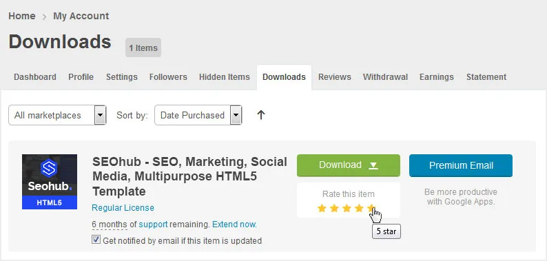
How to rate this item
If you like our theme and support, please do not forget to rate it with 5 stars in your ‘downloads’ section and write a review in comments as it will add more value to our services!
Just click http://themeforest.net/downloads and you will see this template there. Hit 5 Stars to make us happy and we will make more awesome templates for you 🙂
Change Log
Version 2.1
– 15 May 2018
- Added: SASS Files
Version 2.0
– 07 April 2018
- Added: Popper.js
- Updated: jQuery Library to Latest Version
- Updated: Bootstrap 3 to Bootstrap 4
- Updated: jQuery Bootstrap Select Plugin updated to support Bootstrap 4
Version 1.1
– 15 Sep 2017
- Fixed: Responsive container width spacing issue fixed in 320px screen
- Updated: Service list 01 page HTML structure update
- Updated: Home 2 and home 3 Revolution slider HTML code update
- Updated: Minor code/formatting improvements and fixes.
Version 1.0
– Initial Release
Source & Credits
All images and videos are for preview purposes only and are not included in the download files. Images are of copyrights under Creative Commons CC0.
Images
- Shutterstock Shutterstock
- Freepik Freepik
Video
- Dissolve Dissolve
Scripts
- Revolution Slider Premium Plugin
- Mega Menu Premium Plugin
- Jquery
- Owl Carousel 2
- Magnific Popup
- isotope
- Jquery appear
- Counter
CSS & Fonts
- Bootstrap
- Font Awesome
- Google Fonts
- — Lato
- — Montserrat
Note For questions on basic HTML, Javascript or CSS editing – please give your question a quick Google or visit W3Schools as template issues get top priority. You will need some knowledge of HTML/CSS to edit the template.